A.V. DEL CARMEN
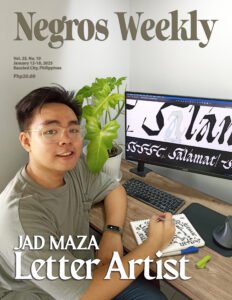
A young Ilonggo is etching his name in the creative world of the print media and letter arts.
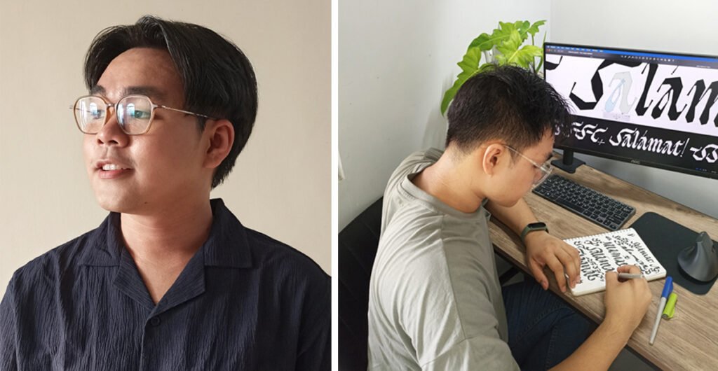
He is John David ‘Jad’ Maza, 26, a native of Pavia, Iloilo, who has created about a dozen typefaces, or designs of letters, numbers and other symbols used for printing or for electronic display.
A discussion on typography design during a college journalism training in Talisay City about five years ago paved the way for him to further engage in this creative pursuit.
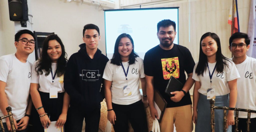
Conceptualizing designs has been part of John David’s academic discipline as he earned his Bachelor of Science in Packaging Engineering from Central Philippine University, where he started as layout artist during his freshman year, and later rose to the rank of managing editor, associate editor and, eventually, editor in chief of The CENTRAL ECHO, the university student publication.
He further honed his skills in the industry by earning a Post-graduate Certificate in Type Design through the Type West program of Letterform Archive, an international organization engaged in the development, promotion and preservation of letter arts.
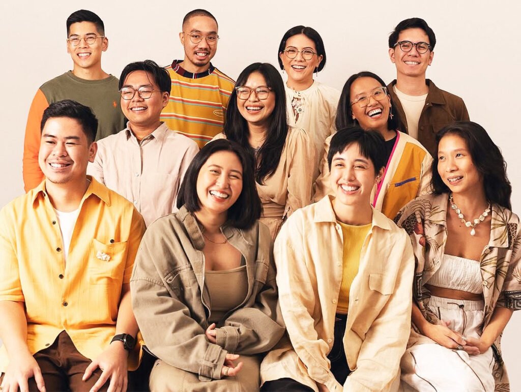
At present, Jad is a brand designer and creative director at the Pasig City-based And A Half Design Studio.
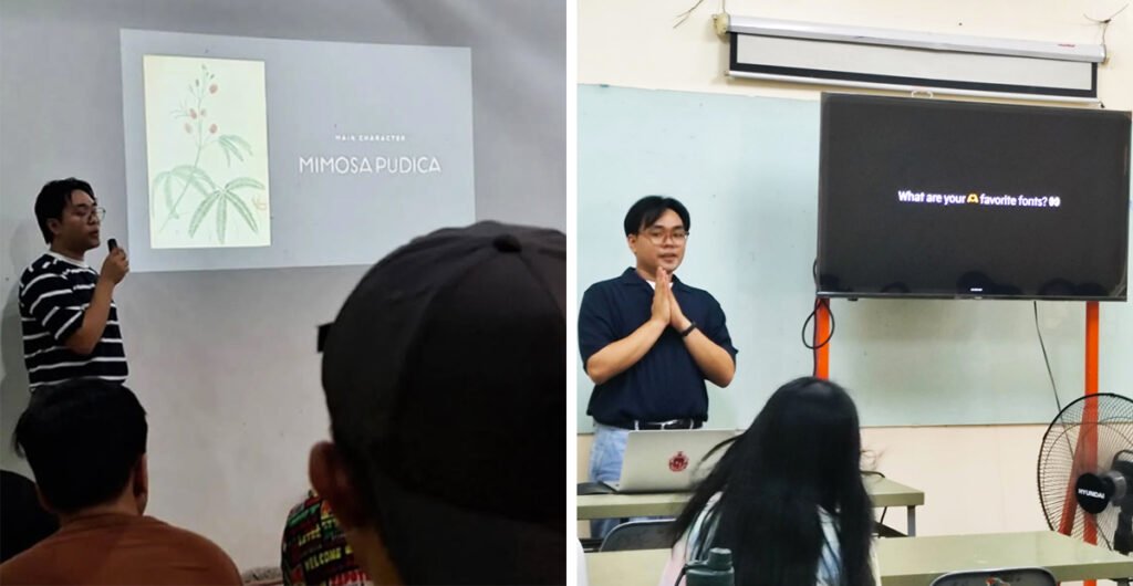
The visual designer shared his experiences in his creative typography journey and how his works are contributing to the growth of Filipino cultural awareness in the following Q&A interview with NEGROS WEEKLY.
***
Please tell us your background in journalism and the print media industry.
I started as a layout artist of The Central Echo during my freshman year in 2015, then later on took on higher roles like managing editor, associate editor and later editor-in-chief but I still mainly did the layout for our publication during the latter years.
When did you begin interest in the study of fonts/typefaces? What led you to get interested in it?
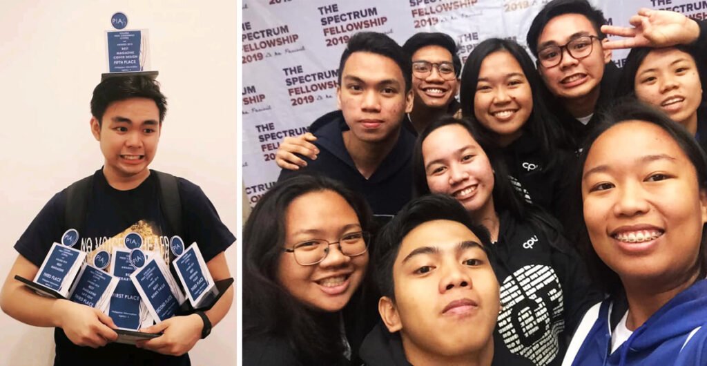
A huge chunk of doing publication design is choosing and utilizing fonts, so I got excited during the Spectrum Fellowship in 2019, when I attended a talk (titled “Patriotism through Digital Art”). The speaker, Aaron Amar, shared how they were making fonts inspired by jeepney signages, the tools used and the process to publish the projects.
Making fonts kept me busy at home during the pandemic. In 2022, I had the opportunity to enroll in Type West, a yearlong program in type design offered by the Letterform Archive based in San Francisco.
While it was originally just an inperson program at the Archive, due to the circumstances, it evolved to develop an online curriculum where I was fortunate enough to join, with the goal of making more quality Filipino fonts in the future.
How did you develop your set of fonts/typefaces? What inspired you to design these?
After that talk, it was like a light bulb moment for me – “I can also make my own fonts?” I’ve been using lots of fonts for so long, never did it occur to me that I could make my own. That was the trigger for me to make one myself.
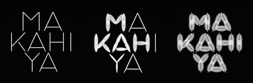
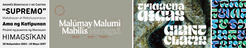
One lazy day during our OJT around November in 2019, I brought my laptop to the office and tinkered with a font-creation software (Fontforge). Then came the pandemic and lockdown. I found the time to complete the alphabet and publish my first font, Maragsâ, a passion project inspired by those lessons in Filipino classes that most of us would hate in school, and celebrate the different languages in the Philippines.
How many fonts/typefaces have you developed so far?
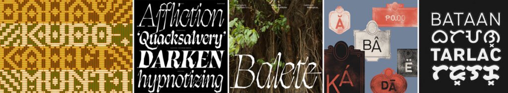
With the new addition of my recent font family Balete, it’s currently at 50 fonts across 11 different typefaces (excluding custom fonts for brands).
How about typefaces which you are in the process of developing?
There’s actually just a lot work-in-progress and still unreleased; it’s a usual theme among type designers to continuously churn and draw letters and have lots of WIPs. Whenever you get tired working on one font project, all you need to do to rest is…by starting another one.
But not all those drawings will have a functional alphabet/character set completed and will be available to the public. I usually post these “experiments” on Instagram (instagram.com/jad.otf) or on our Facebook page (Jad Maza), and when I feel there’s interest in it, then that’ll be the next one I’ll focus on and complete.
Please describe the process of registering this intellectual property.
Based on my understanding, for fonts, you’re automatically a copyright owner. Your credentials can be embedded in the font files/software you generate.
Then we also prepare an End User License Agreement, or EULA – this is a document outlining the terms of how you want your fonts to be used.
The idea behind distributing fonts is – the designer is still the owner, and you’re just letting people use it/ giving them the license. This document should accompany your font during distribution.
To what extent can your works be freely used now by the printing industry?
Some of my earlier work, like Maragsâ, I’ve distributed Free for Commercial use, and I also have paid retail fonts on my shop (jadmaza.gumroad.com), as well as with foundries such as the France-based Blaze Type (blazetype.eu/about/jad-maza).
I post all my released typefaces on my Behance portfolio (behance.net/jadmaza).
What feedback on your works have received so far?
By the time I posted about Maragsâ on Facebook, it received a lot of reactions and comments and got shared by the thousands, with captions like, “Tahum” and “Lessons sa Filipino, we meet again”.
The next day, I woke up to an article about it in Scout Magazine, dubbing it “a love letter to Filipino accent marks.” It was not just an overwhelming experience, but also heartwarming for my simple passion project to have that reach. Maragsâ is still my most downloaded font until today.
In the past five years of designing fonts, I feel that there is a thirst for Filipino-designed typefaces. I’ve been receiving lots of support and encouraging words, especially from fellow Filipinos – how they’d resonate with the fonts, reminisce or learn something new about our culture and feel a sense of pride, and how they’d use the fonts just because a Pinoy designed it.
That’s also why it’s great to see the growth/discovery of the type community here in the Philippines through community platforms like Type63 showcasing typographic works by Filipinos (for more fonts made by Filipinos, visit type63.ph/directory). | NWI
The title of this article uses the letter artist’s MARAGSÂ font.